The UI System Kit.
We define components and rules so that design and development work seamlessly together. You will receive a consistent UI system that accelerates releases, reduces rework, and feels like your brand throughout.
🧩 Unified Components
🎨 Clean Tokens and Rules
🤖 Ready for AI-Powered Workflows
Brands that rely on our work


⚡️ Consistency without thinking
Users expect the same elements to behave the same way.A UI system ensures this without having to make new decisions for every detail.

💸 Less duplicate work
Without shared components, multiple versions of the same element can quickly arise. A UI system consolidates these building blocks in one central place, saving time in design and development.

📈 Scale effortlessly
As the product and team grow, clear foundations are needed.A UI system ensures that new screens are created fasterwhile still feeling cohesive.

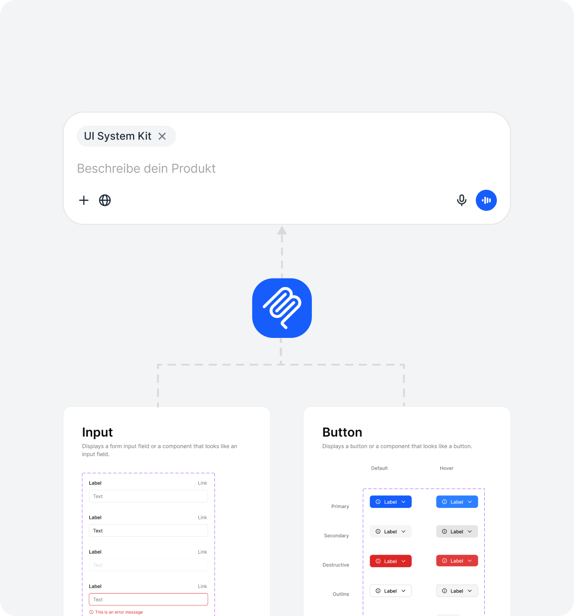
What does the UI System Kit include?
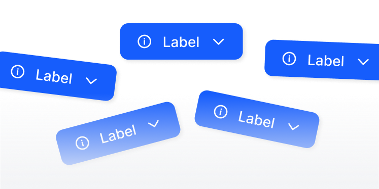
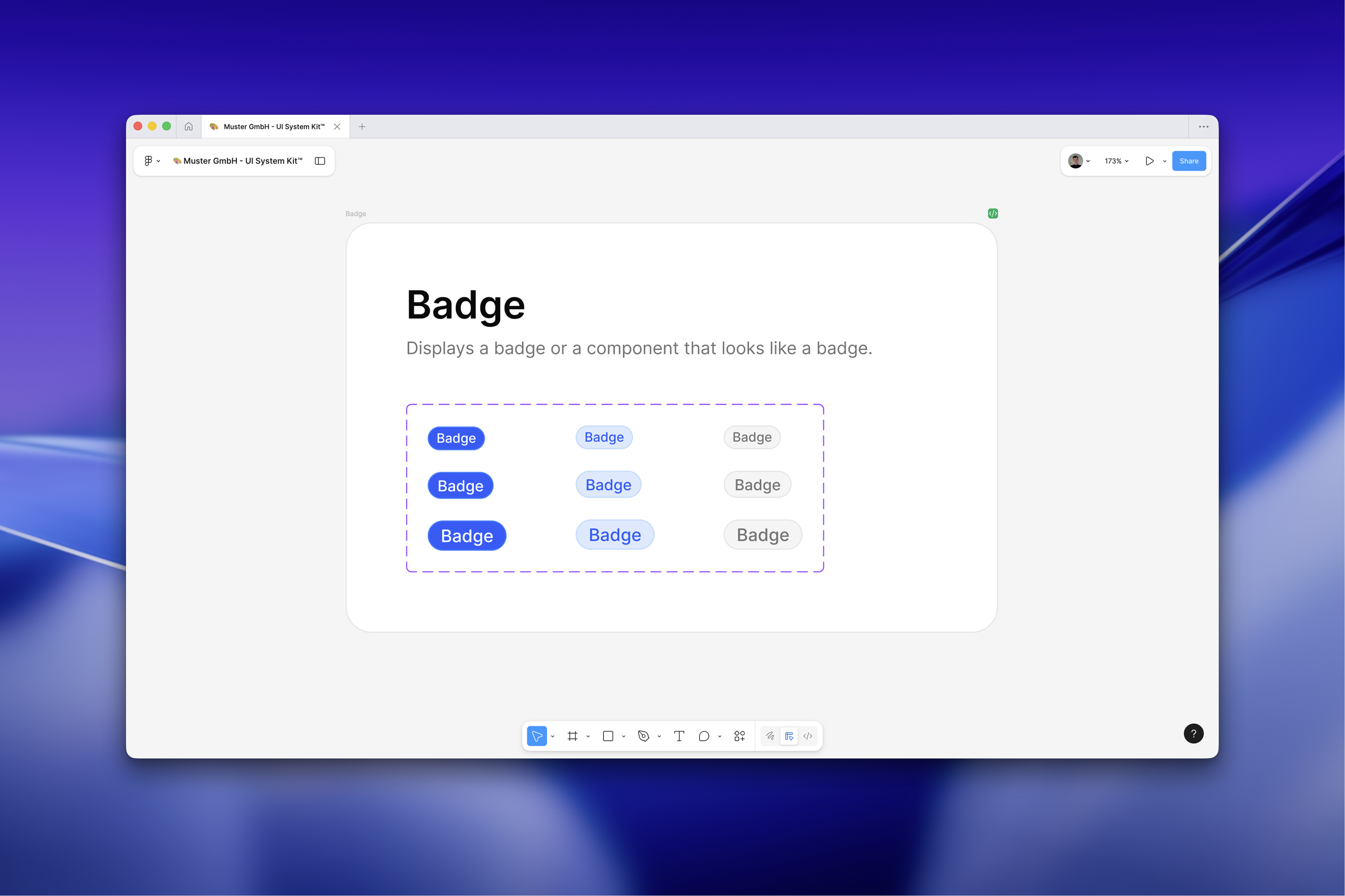
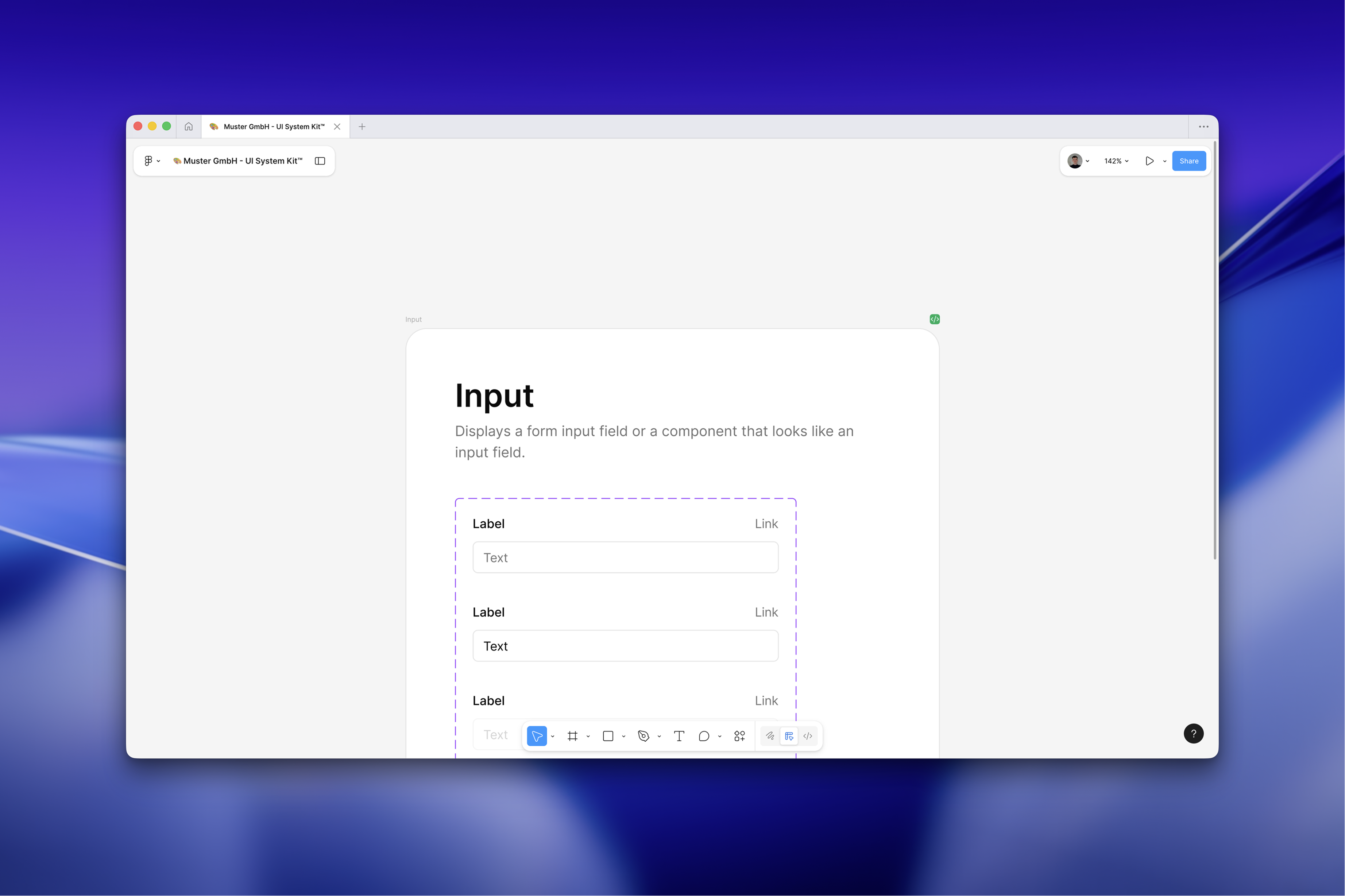
Modular Component Kit
You receive a fully assembled UI systemmade up of clearly defined, reusable components.

Consistency by Design
Once defined, applied the same everywhere.
Ready for AI
A structure that accelerates development and is prepared for AI.
The interface between design & code
A clearly defined component set as a common language for design and development. What exists in design can be directly represented in code.

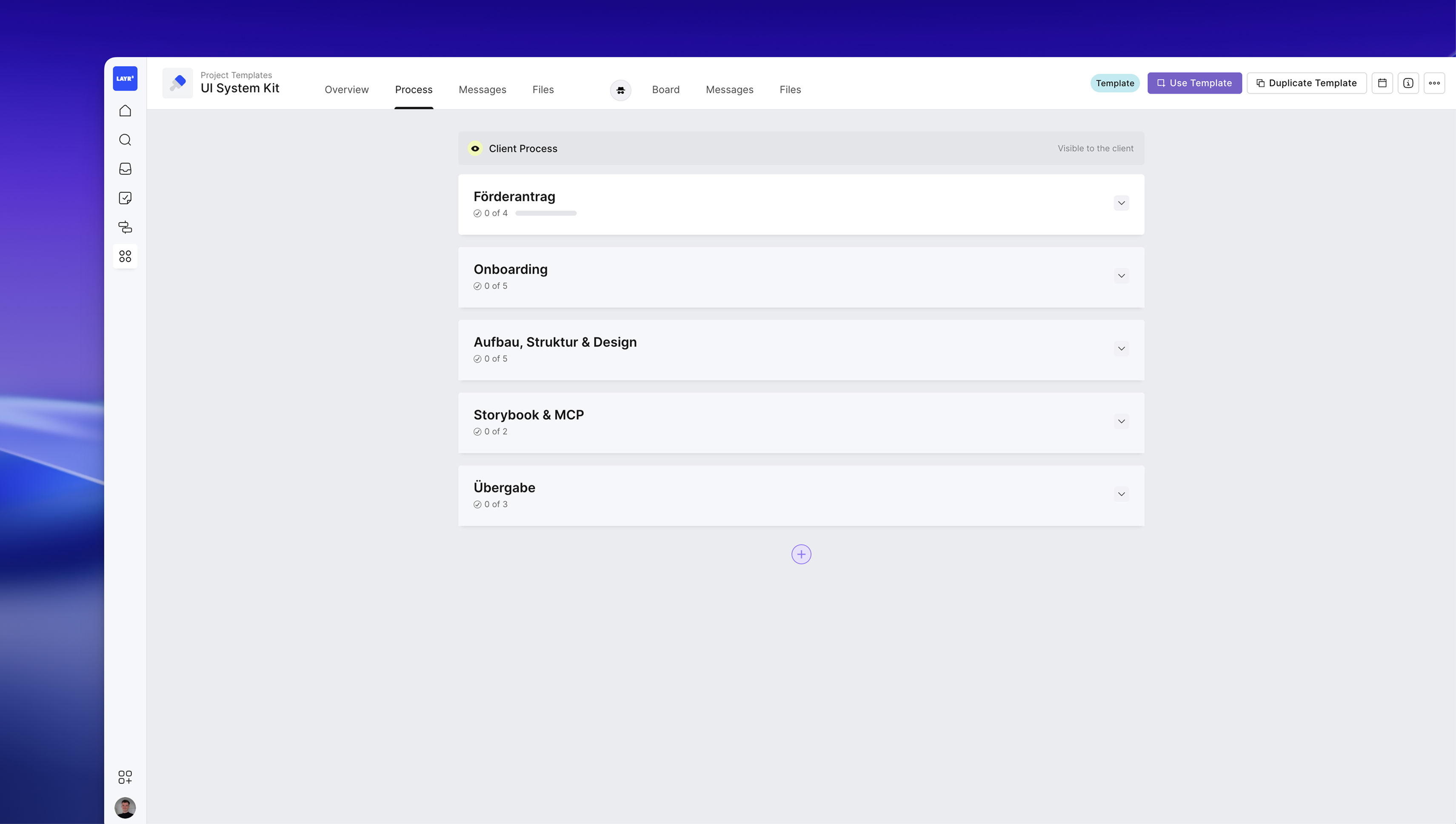
This is how your UI System Kit is created.
Free Discovery Call
A 30-minute call to understand your business goals and current challenges, and to establish the focus of the analysis.

Onboarding
In a concise meeting, we will clarify core flows, brand guidelines, technical frameworks, and desired KPIs. The outcome will be a streamlined plan with an initial component list and token scope, ensuring a smooth start to development and integration.

Structure
We establish the visual foundation and create the essential building blocks. Colors, typography, spacing, and radius are defined as tokens, followed by all core components with clear variants and states for every use case.

Update Call
We want to assure you that our work is heading in the right direction. That's why we will present the results of our analysis before creating new designs.

MCP Integration
We blend design and code for seamless implementation. Components are documented in Storybook and linked with design references, including states and accessible examples. At the same time, we set up the MCP Server: Figma Variables, Dev Mode tips, and Code Connect mappings, ensuring that the generated code reliably integrates from your system while maintaining brand consistency.

Handover
A 90-minute meeting where we will review all the results, answer questions, and plan the implementation.

Create a stable UI foundation
We build a UI system that grows with your product.