UI Design

Consulting

HiQ Germany: Simplifying Complex Bureaucracy

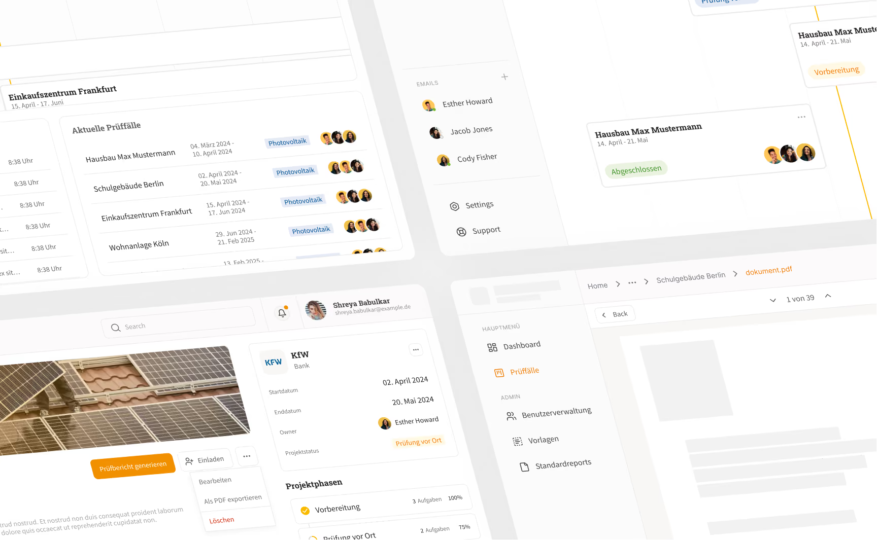
Screenshot einer webbasierten Projektmanagementanwendung mit Übersichten zu Prüfphasen, aktuellen Prüffällen, E-Mail-Kontakten und Dokumenten; zeigt Projektstatus mit Zeiträumen und Teamfotos sowie Navigationselemente wie Dashboard, Prüffälle, Benutzerverwaltung und Standardreports.

1/2

Months of Project Duration

Within just two weeks, we developed a concept from the first idea to
a clickable demo prototype.

32h

Hours Invested

Close collaboration with the HiQ team allowed for fast iterations
and tailored results.

58

Components Designed

From form fields to complex dashboard widgets – all tailored for a consistent and scalable user experience.

Efficient Subsidy Case Reviews

For HiQ Germany, we designed a web application to structure and evaluate grant applications efficiently.
The focus was on representing complex review cases in a way that makes all key information visible at a glance, enabling fast, informed decisions.
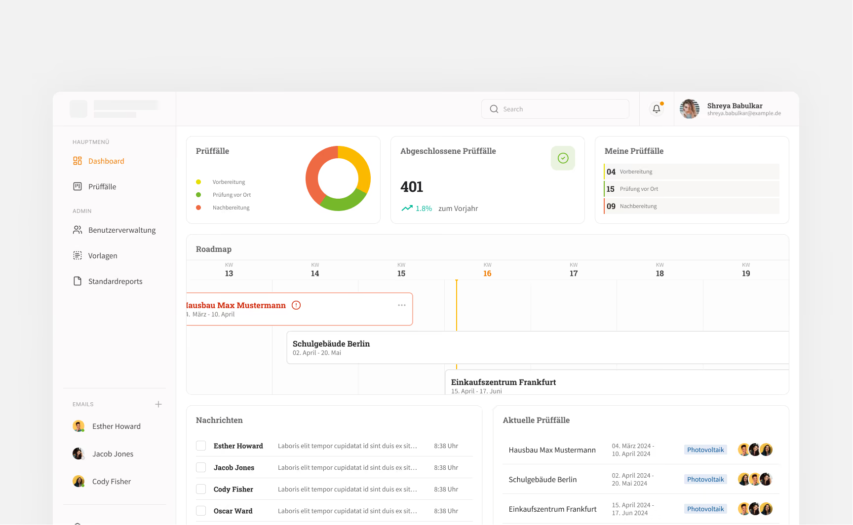
Dashboard einer Prüfungssoftware mit Navigationsmenü links, Suchleiste oben und Benutzerprofil rechts oben. Zeigt Prüffälle in drei Status: Vorbereitung, Prüfung vor Ort und Nachbereitung, visualisiert in einem bunten Donutdiagramm. Anzeige von 401 abgeschlossenen Prüffällen mit 1,8 % Zuwachs im Vergleich zum Vorjahr. Eine Roadmap zeigt Termine für Projekte wie Hausbau Max Mustermann, Schulgebäude Berlin und Einkaufszentrum Frankfurt. Nachrichtenliste links mit Namen und Auszügen, und aktuelle Prüffälle rechts mit Datumsangaben und Fotovoltaik-Labels sowie Avataren der zuständigen Personen.

High-Fidelity Prototype & Design System

Based on clear requirements, we built a clickable prototype with a consistent design system. Colors, typography, and components were tailored to support the review workflows effectively.
Even in this early phase, the prototype demonstrates what intuitive and future-proof grant management can look like.
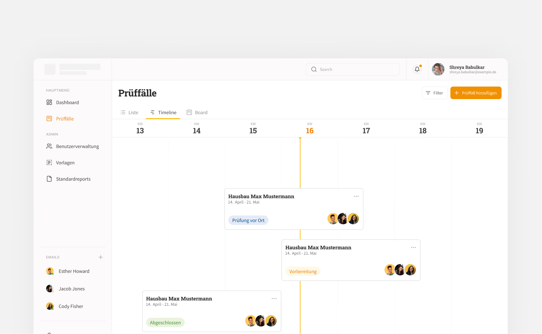
Bildschirmansicht eines Prüfungsfall-Management-Tools mit einer Timeline-Ansicht von Kalenderwochen 13 bis 19, die Prüfungsfälle namens Hausbau Max Mustermann zeigt, mit Statusanzeigen wie Prüfung vor Ort, Vorbereitung und Abgeschlossen, sowie Avatare von Teammitgliedern.

”The collaboration with Layr Eight GmbH was simply great! Communication was seamless right from the start - short response times and always reliable answers made the process extremely easy. We were particularly impressed by the excellent advice on UI/UX drafts. Despite an extremely tight deadline, the work was carried out quickly and to the highest quality. Absolute recommendation!”

Jana Hamann

HiQ Group
More Insights

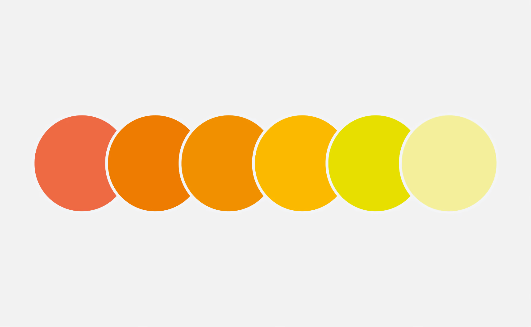
Sechs übereinander angeordnete Kreise in einem Verlauf von Rot über Orange, Gelb bis Hellgelb auf hellem Hintergrund.
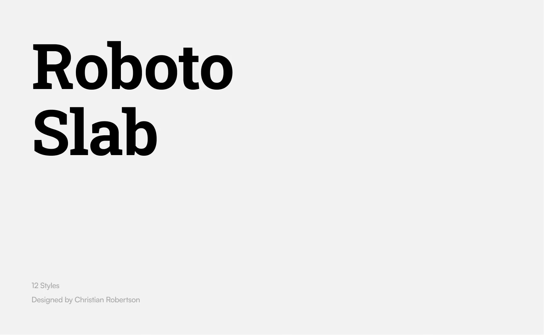
Text 'Roboto Slab' in bold black font on a light gray background with smaller gray text below reading '12 Styles' and 'Designed by Christian Robertson'.
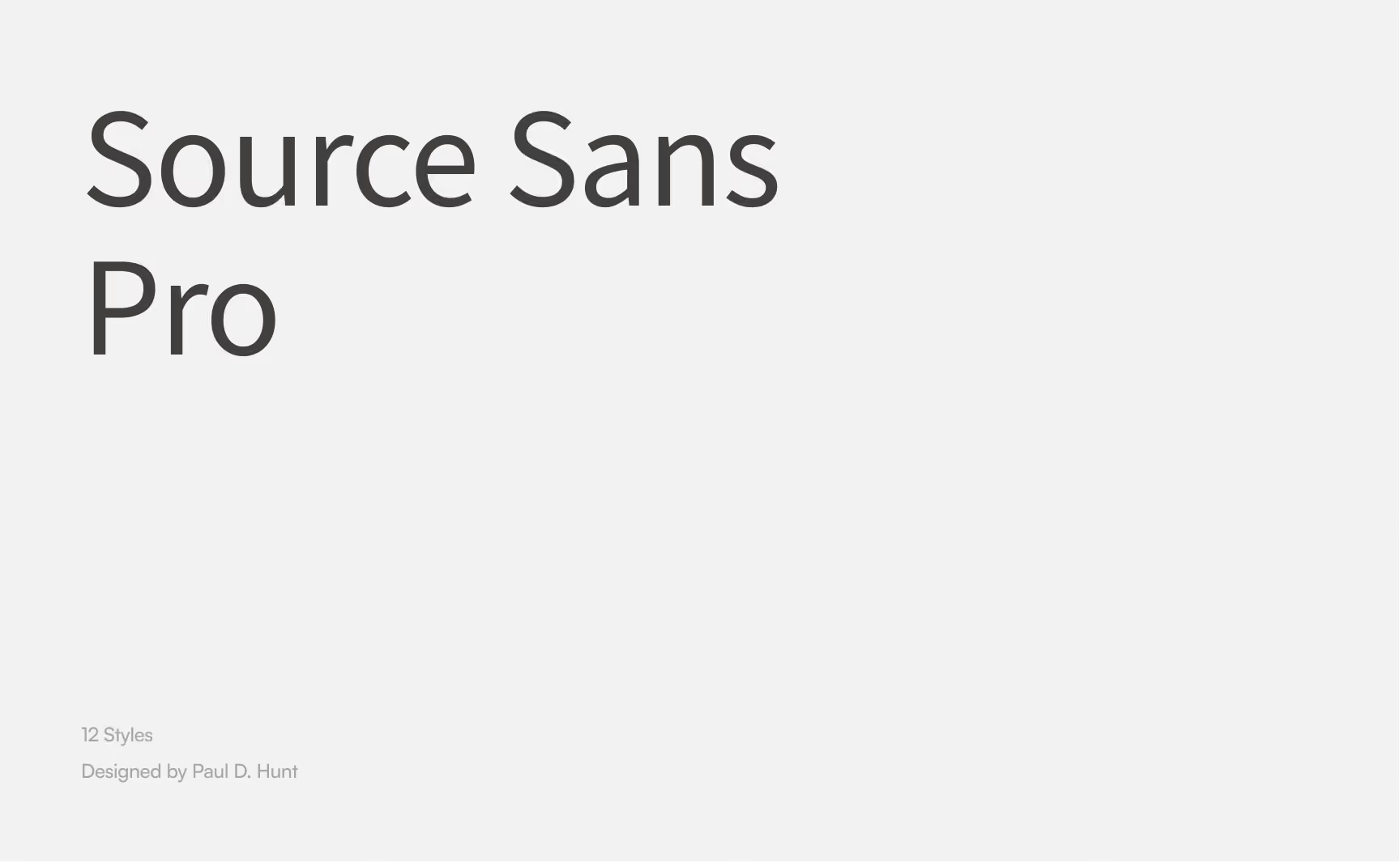
Text in Source Sans Pro font displaying the font name, noting 12 styles and design by Paul D. Hunt on a light gray background.
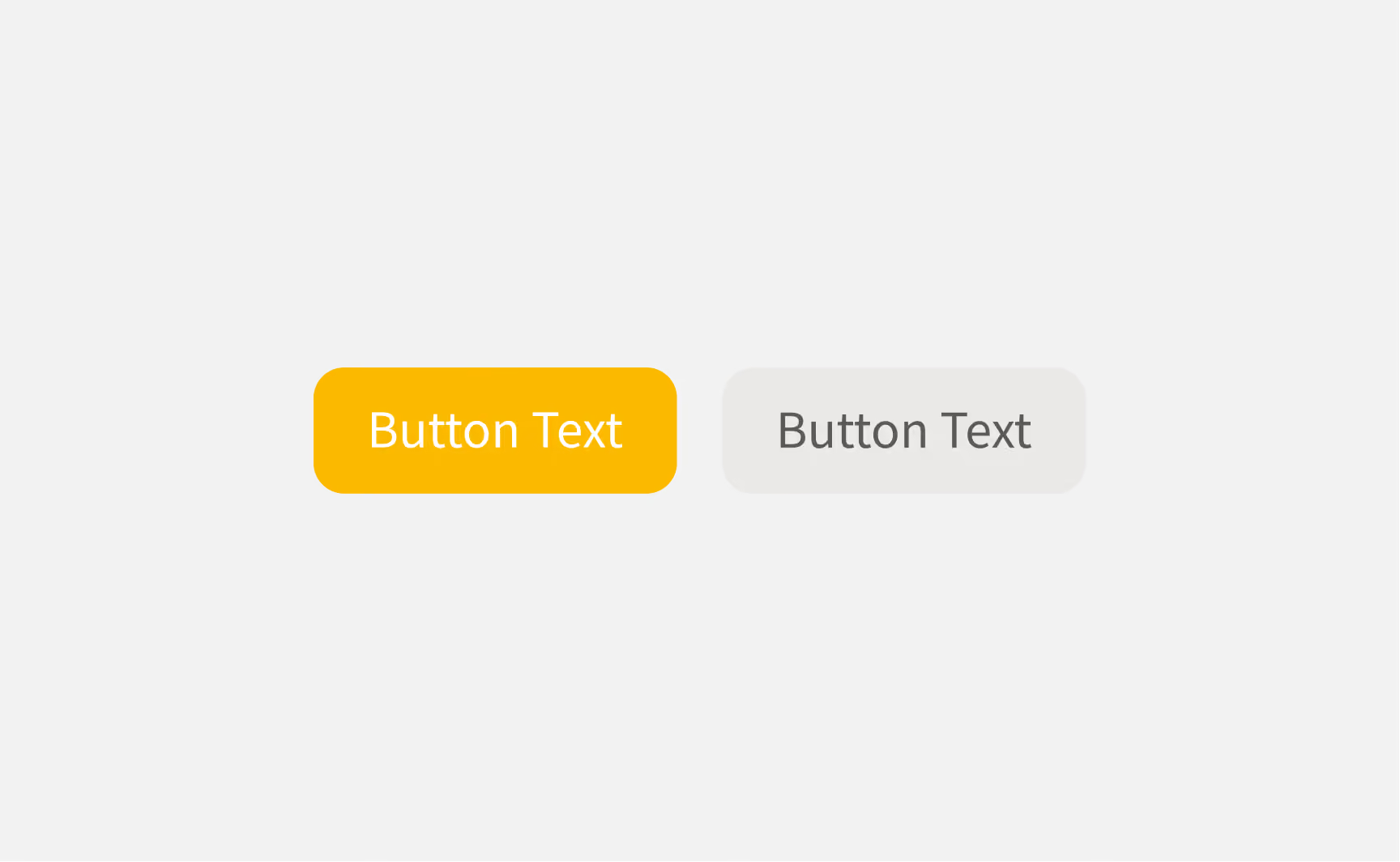
Zwei rechteckige Schaltflächen mit abgerundeten Ecken: die linke ist orange mit weißem Text "Button Text", die rechte ist hellgrau mit dunkelgrauem Text "Button Text".

Inquire about your next project now

Let's do something great together.

Request a project