UX that turns clicks into customers.
We identify where your visitors drop off. Test solutions with real shoppers. Implement them directly in your Shopify theme.
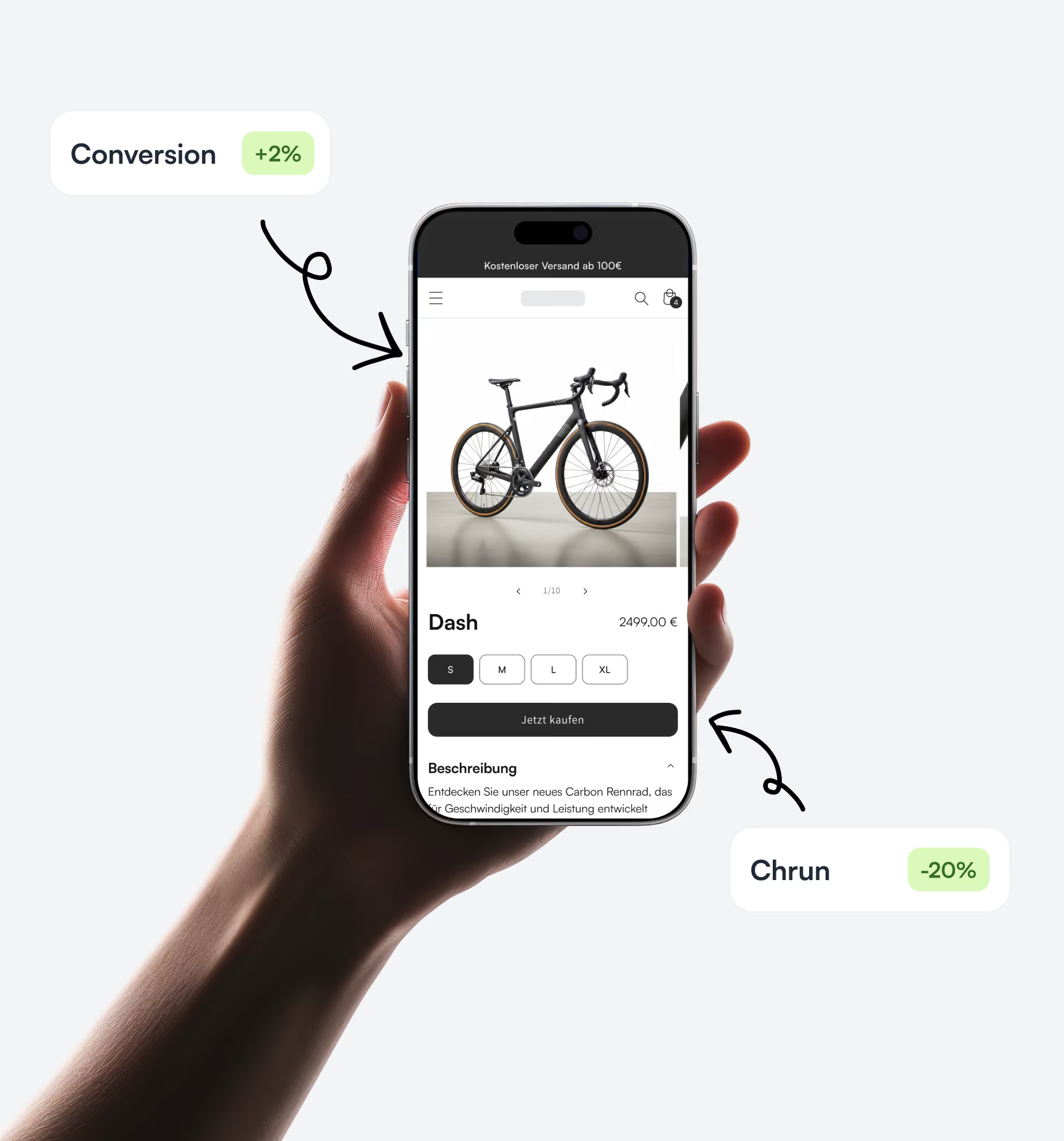
🎯 More purchases per visitor, without increasing ad spend.
📊 Data-driven analysis instead of gut feeling.
🚀 Validated by real shoppers, not just assumptions.
Ein Auszug unserer zufriedenen Kunden





💸 Every lost click eats into your margin
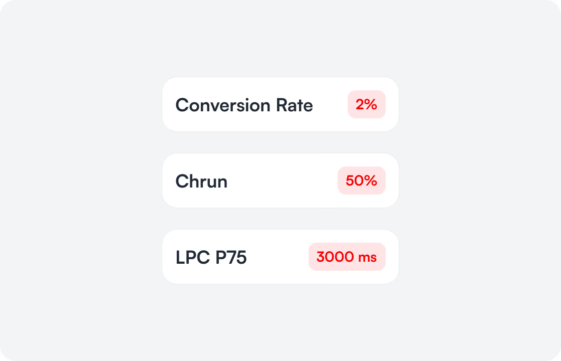
You pay for every click. If 98 out of 100 visitors leave, you don't have a traffic problem. You have a conversion problem. Unclear sizing information, slow product images, a confusing checkout. Every UX friction point eats into your margin.
📈 One layout detail can drive sales
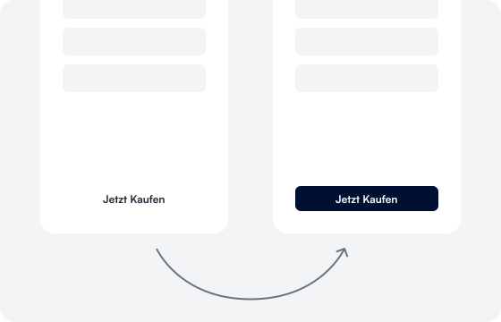
Shopify themes are quick to set up, but they are rarely optimized for your target audience. Where is trust established? Which product image sells better? Is a badge enough, or is a guarantee missing? A change in the right place will boost your conversion, without increasing ad spend.
💡 Wir kennen die Patterns
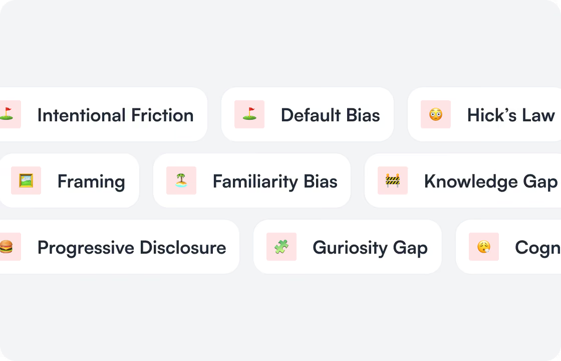
Wir wissen, was D2C-Shops verkaufen lässt. Und was Käufer in Sekunden vertreibt. Aus Daten, Heatmaps und Session Recordings sehen wir, wo deine Besucher abspringen. Wir verbinden das mit bewährten E-Commerce Patterns und liefern Anpassungen, die dein Theme direkt umsetzen kann.
How we support you.
Prioritized conversion levers
Every lever is prioritized by estimated revenue impact. You know where to generate revenue first.

Validated with real buyers
Every change is tested with real buyers from your target audience. You never launch blindly.

Directly for the Shopify Theme
Clearly structured for your
Theme update.
High-fidelity mockups instead of PDFs
Clickable mockups that go live exactly as designed. No back-and-forth between design and theme development.

Our Process.
Free Discovery Call
30 minutes on the phone. We understand your shop's current status, what you want to achieve, and if we are the right partner.
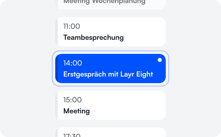
Onboarding
We get access to Shopify Analytics, GA4, and heatmaps. You provide us with context on your product, margin, and target customer.
Analysis
We analyze the entire funnel: landing page, product page, cart, checkout. We identify where margin is lost and prioritize by impact.
Update Call
Before we create designs, we review the findings together. You decide which levers we tackle first.
User Testing
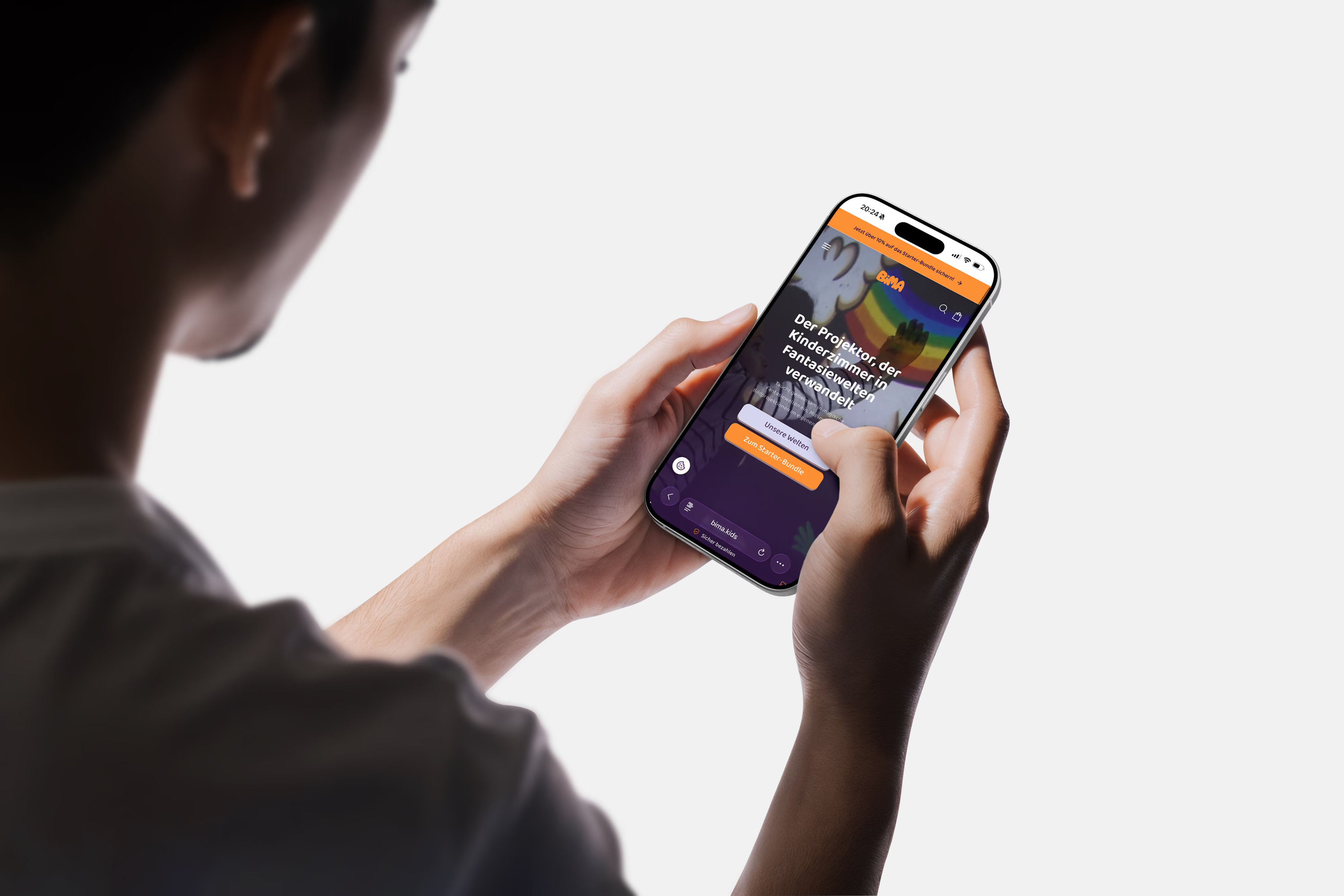
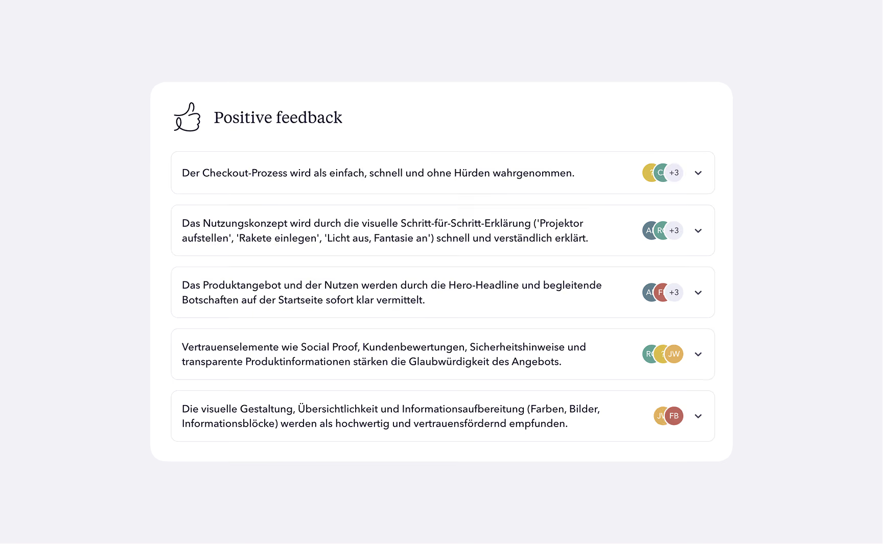
We test the new designs with real buyers from your target audience. You go live with validated solutions, not assumptions.
Handover
90-minute meeting. We review all results and plan the theme implementation.
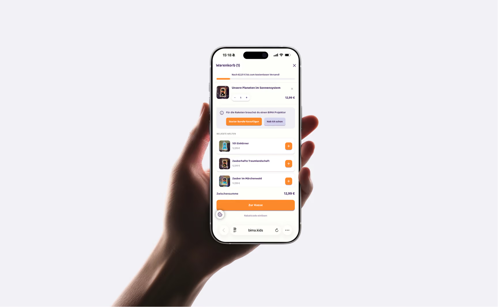
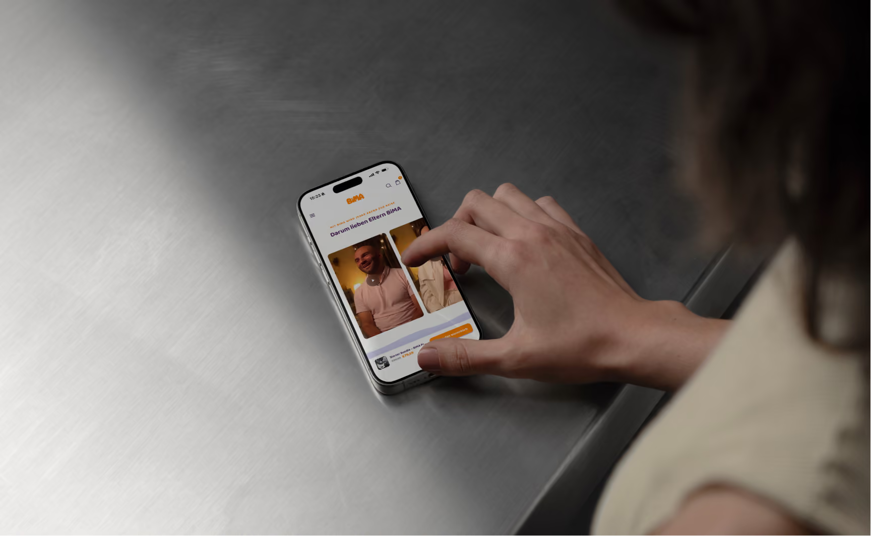
Make the right UX decisions
We'll show you what to tackle next.