The Real Cost of Bad UX
There's a type of cost that almost no company tracks. It doesn't show up in the P&L, not in controlling, not in the quarterly report. Yet it affects revenue, support overhead, employee productivity, and customer retention all at once.
We're talking about user experience. More specifically: the points in a product, a website, or an app where the experience simply doesn't work.
This article is an invitation to look more closely. Because the interesting insight isn't that bad user experience costs money. Most people suspect that already. The interesting insight is where it does — and why it's so hard to see.
What User Experience Actually Means
Before we talk about costs, a brief clarification is in order. The term user experience is often equated with the visual design of a user interface. Nice colors, modern typography, clean layouts. But that falls short.
User experience describes the entire experience a person has when interacting with a product. From the first impression to daily use to the question of whether someone comes back or recommends it to others. The ISO 9241 definition puts it this way: UX encompasses all aspects of a user's experience when interacting with a system, product, or service.
The distinction from related terms matters here. Usability describes how efficiently and error-free someone can complete a task. User interface design concerns the visual and interactive design of the interface. User experience design goes further: it considers the entire user journey, the needs and expectations of users, the context of use, and satisfaction over the full period of contact.
This distinction isn't an academic detour. It's the reason many companies fail to recognize UX problems: they look at the surface while the real issue lies in the experience.
A Form Field and Its Consequences
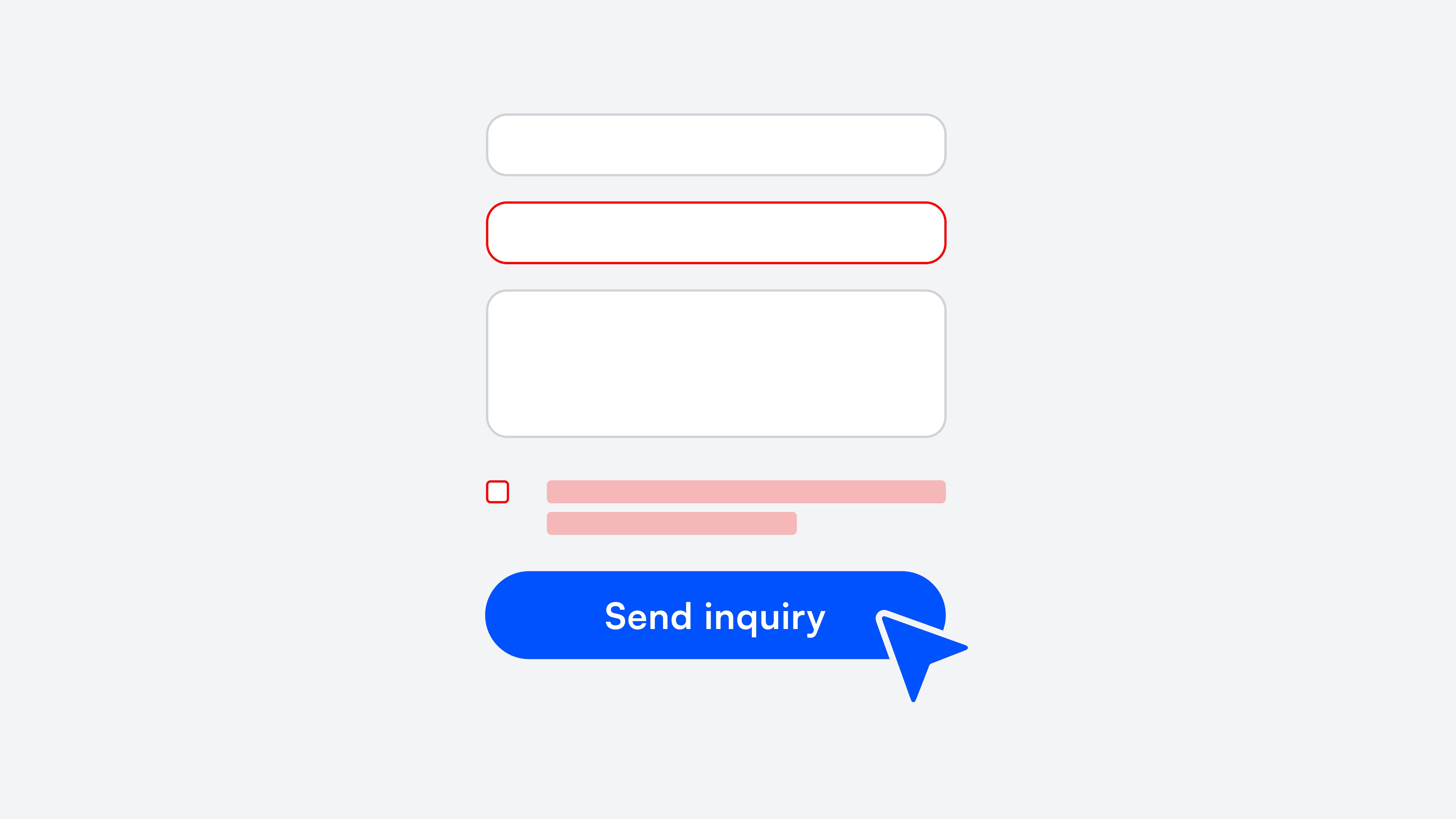
A thought experiment. A SaaS company has a pricing page on its website with solid traffic. The call-to-action leads to a signup form. Seven fields: name, email, company, industry, team size, phone, password.
At some point, someone from sales asked to add phone number and industry. Understandable. More context for the first sales call. So two fields were added.
What typically doesn't happen next: someone checks how these two fields affect the completion rate. Yet the connection is well documented. Each additional field increases cognitive load and the perceived level of commitment. Users who just wanted to take a quick look drop off. Not because the product doesn't interest them. But because the form asks for more commitment than they're willing to give at that moment.
The lost revenue doesn't appear in any spreadsheet. It's the gap between what could have been and what is. And it repeats every month.
The Five Areas Where UX Costs Accumulate
What makes this topic so complex: the costs of bad user experience are never concentrated in one place. They're spread across departments, budgets, and responsibilities. That's why no one sees the full picture.
Conversion and Revenue
Every step in a digital process has a completion rate. From clicking the CTA to completing a purchase on a website, from registration to first active use of an app. At each of these steps, interaction details determine whether someone continues or stops.
An unclear button label. A loading bar with no context. An error message that doesn't explain what went wrong. Individually, these are trivial. Combined, they can make the difference between a conversion rate of 2% and 3%. For a product with six-figure annual revenue, that one percentage point isn't a rounding error.
Good user experience design addresses exactly this: not the grand vision, but the small touchpoints where users decide whether to stay or leave.
Support
It's worth taking a look at the most common support requests. Not the complicated cases. The simple ones. "Where do I find my invoice?" "How do I change my payment details?" "What does this status mean?"
These aren't stupid questions. They're questions that a well-designed user interface would make unnecessary. Each one costs processing time, ties up service resources, and signals to the customer: you need help with something that should be self-explanatory.
Anyone who sorts the support tickets from the last few weeks by this criterion often finds that a surprisingly large share traces back to navigation problems. To a lack of usability, not to actual product defects.
Internal Productivity
External products and websites get a lot of attention. Internal tools and software, surprisingly little. Yet employees often spend hours per week with systems that have grown organically, were never fundamentally redesigned, and aren't truly loved by anyone.
The CRM with three different ways to create a contact. The reporting tool that has an unofficial Google Doc full of workarounds. The ticket system with interface fields that no one has filled in for two years — but no one deletes them either.
Nobody complains loudly about it. Teams adapt. They develop their own methods, write cheat sheets, ask colleagues. But every minute spent on navigation instead of work is a minute missing somewhere else. Scaled across an entire team over an entire year, that adds up to a significant sum. The design of internal software deserves the same attention as external products.
Customer Retention
This point may be the most expensive — but also the quietest. Because customers who leave due to bad user experience rarely do so with a cancellation and a reason. They simply use the product, the website, or the app less and less. Eventually, not at all.
In the churn report it might say "inactive" or "no login in 90 days." What it doesn't say: that the user gave up on the third attempt to change their plan. Or that the onboarding was so overloaded they never truly arrived. The customer experience decides at these moments whether a person stays or goes.
The result is a gradually declining customer lifetime value and rising acquisition costs. A cycle that's hard to break as long as the root cause in the user experience goes unrecognized.
Reputation
One last aspect that's often overlooked. Digital experiences get reviewed, screenshotted, shared. A clunky checkout process can end up in a Google review. A frustrating app onboarding becomes an industry anecdote. And once a company is perceived as "cumbersome," it takes a lot of effort to correct that image. Good usability, in this sense, is also a form of advertising. Poor usability is the opposite.
Why the Problem Is So Persistent
The obvious question: if these costs are so real, why aren't they addressed already? The answer has less to do with ignorance than with structure.
The costs have no owner. Marketing sees bounce rates on the website and optimizes campaigns. Support sees ticket volume and hires more staff. Engineering sees feature requests and prioritizes. Each department treats the symptoms in its own area. But the shared root cause belongs to no budget and no team.
UX gets confused with aesthetics. "The design looks fine" is a sentence that, in many companies, marks the end of a UX discussion. But user experience isn't about how a user interface looks — it's about how the interaction with the product feels. A form can be visually flawless and still have a high abandonment rate because the fields are in an illogical order.
The distinction between "looks good" and "works well" is central to understanding user experience design. Only when companies stop treating UX as an aesthetics question does the topic get the strategic importance it deserves.
Habituation creates blind spots. People are remarkably good at adapting to suboptimal conditions. After a few weeks with a clunky system, the workaround doesn't register anymore. It becomes routine. Internally, that works. Externally, it doesn't. Customers and users don't have an adjustment period. They expect a product to work on first contact.
How to Measure the Current State
This is the part of many articles where numbers like "88% of users don't come back after a bad experience" appear. Such figures are rarely as universally applicable as they sound. They come from specific studies with specific audiences.
More helpful than generic statistics are targeted methods applied to your own product.
Funnel analysis per step. Don't look at the overall conversion — look at the drop-off at each interface in the process. Often there's one step that performs significantly worse than all others. That's the biggest lever.
Support ticket audit. Go through the last 50 tickets and ask for each one whether it could have been avoided with better usability. The method is simple; the result is often eye-opening.
Usability testing with real users. Five people are enough to make the most critical problems visible. It's not about elaborate studies — it's about watching real people use the product. What usability tests reveal doesn't show up in any dashboard. They surface aspects of the user experience that pure numbers can't capture: hesitation, frowning, wrong clicks, quiet cursing.
Task success rate. How many users manage to successfully complete a defined task on the website or in the app? Task success rate is one of the most honest UX metrics because it measures what truly matters: do users reach their goals?
Net Promoter Score as a UX indicator. The NPS doesn't just measure brand perception — it also reflects the emotional quality of the customer experience. A low recommendation rate is often a symptom of usability problems, not just dissatisfaction with the service or the product itself.
Small Changes, Big Impact
The good news: a complete redesign is rarely needed. Many of the most effective improvements in user experience design are surprisingly small.
Error messages that actually help. The difference between "Invalid input" and "The IBAN seems too short. Check that all 22 digits are there" determines whether a user tries again or gives up. Good error messages are one of the most underrated aspects of good usability.
Forms that only ask what's necessary. Every field that isn't needed at that moment is a hurdle. What can be asked later should be asked later. Optimizing forms is often the fastest path to better conversion.
Empty states that provide orientation. When a dashboard is empty because someone just got started, many products display: "No data available." A good empty state explains what will happen here instead, and shows the next step. Designing such states is part of thoughtful user experience design.
Consistency across pages and features. When the "Save" button is top-right on one page, bottom-left on the next, and labeled "Apply" on the third, users constantly work against small cognitive frictions. A design system that defines standards for components and interaction patterns solves this. It's less a creative investment than an infrastructural one.
These kinds of changes can be implemented in days, not months. The prerequisite is knowing where to start. A structured UX audit of the three to five most important flows — ideally combined with usability testing and real user feedback — delivers a prioritized list that's immediately actionable.
User Experience as a Design Process, Not a Project
One aspect that's often shortchanged: UX design isn't a one-time project. It's an ongoing design process. Products change. New features get added. User needs evolve. What works today can be a problem in six months.
Companies that understand user experience as part of their product development integrate methods like user research, usability testing, and iterative design into their process. It doesn't have to be elaborate. Even a brief monthly check of the most important metrics and a conversation with real users provides valuable insights.
The approach is comparable to design thinking: understand, observe, ideate, test, improve. Not a linear project, but a cycle that makes the user experience better piece by piece. Accessibility and inclusive design ideally flow in from the start, rather than appearing as an afterthought.
To Close
Bad user experience isn't a sign of negligence. In most cases, it's the result of organic growth, distributed responsibilities, and the perfectly normal reality of companies pursuing many goals at once.
But it has a price. And that price doesn't shrink over time.
The first step is to look. Not with the ambition to change everything at once. But with the curiosity to understand where the biggest levers are. Often, they're not where you'd expect.
If you'd like a second perspective: we're happy to talk. 30 minutes, no strings attached, with a focus on the flows that matter most for your product.
Book your free discovery call
Let's do something great together.